
Week 2
Video Case Study - Stranger Things Title
This was a great task to get started with After Effects and introduce myself to the basics of the software package and interface.

By parenting the components to the null object I was able to globally adjust and key in movement.
Process & Discoveries
The pan behind tool was very useful and will definitely be used for future projects in after effects - this tool allowed me to adjust the point at which an object will scale from.

By parenting the components to the null object I was able to globally adjust and key in movement.

By using animators for each letter, I was able to separately key in the movement with minimal effort - super useful!

Being a huge fan of this series myself, I was very excited to be able to tackle the creation of the introduction motion graphic. I'm happy with how this turned out and have learnt a great deal already!
Kinetic Typography
Inspiration
The topic for this week is Kinetic Typography, I immediately began searching for inspiration for my style frame and motion test. The following images and footage were highly inspirational and helped inform the development of this weeks work.


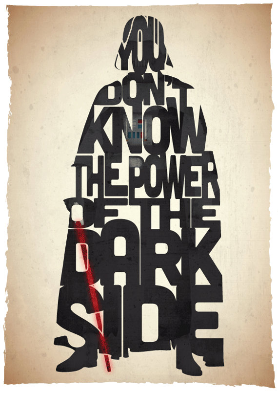
I especially admire this style of typographic art where the words form an image - I definitely wanted to incorporate this into my design.

The topic for this week is Kinetic Typography, I immediately began searching for inspiration for my style frame and motion test. The following images and footage were highly inspirational and helped inform the development of this weeks work.


I especially admire this style of typographic art where the words form an image - I definitely wanted to incorporate this into my design.

The Idea
I decided I wanted to include a graphical element within the style frame to compliment the type. With this in mind, I designed a quick logo/stamp that was in the direction/focus that I wanted for this piece. I was interested in creating a piece that discusses art, design and creative work as a whole, I felt as though the pencil is one of the most recognized symbols for this, and this is where Pencil Warriors came from.
I decided I wanted to include a graphical element within the style frame to compliment the type. With this in mind, I designed a quick logo/stamp that was in the direction/focus that I wanted for this piece. I was interested in creating a piece that discusses art, design and creative work as a whole, I felt as though the pencil is one of the most recognized symbols for this, and this is where Pencil Warriors came from.

Concept Development
With the concept down, I went ahead and started to iterate the design and thought about how I could add the typographic element to the style frame.


With inspiration taken from typographic art, especially the pieces shown previously (see inspiration above). I further developed the focus on the pencil, and finally came up with this. The type creates the silhouette for the pencil with words that express it's meaning. I had an idea where the animation will be focused in on the text, then zoom out and reveal the pencil, for the viewer to 'discover' the underlying creation.

Final Style Frame
The pencil was then added to the visual design to complete the image. I felt as though the most effective typographic motion graphics I found through research; included graphic elements and images to further enhance the style frame & motion.

The pencil was then added to the visual design to complete the image. I felt as though the most effective typographic motion graphics I found through research; included graphic elements and images to further enhance the style frame & motion.

Process & Discoveries
Every word was broken down into it's own layer in illustrator and then imported into after effects as a composition so that each layer is maintained! This was a very useful workflow technique and saved a lot of time. Though there are a heap of layers... there's probably an easier was to organize and manage these.

Using the waveform of the audio I was able to easily match keyframes and layers to the peaks in the sound.

Playing with some effects in aftereffects I was able to create some interesting reveals for the type.

0% - 110% - 100% = Pop effect!
When graphics scale in, I made sure to make them 10% larger before they settle into 100%, this adds an appealing 'pop' effect to the graphic.
For the circle, a radial wipe effect was used.

Every word was broken down into it's own layer in illustrator and then imported into after effects as a composition so that each layer is maintained! This was a very useful workflow technique and saved a lot of time. Though there are a heap of layers... there's probably an easier was to organize and manage these.

Using the waveform of the audio I was able to easily match keyframes and layers to the peaks in the sound.

Playing with some effects in aftereffects I was able to create some interesting reveals for the type.

When graphics scale in, I made sure to make them 10% larger before they settle into 100%, this adds an appealing 'pop' effect to the graphic.
For the circle, a radial wipe effect was used.

Motion Test
Taking inspiration from the Kinetic Typography footage I found, I wanted this design to have an element of audio to go with it. I found some great royalty free audio from http://www.bensound.com/ which went well with the motion. This was my first independent motion graphic in After Effects and was a great learning experience. I was able to play around with the different effects and functions and build a greater understanding/efficiency with animating. Overall I'm quite happy with the outcome, I could definitely improve it in the future as I learn more.
Week 3
Painted Reveal
Inspiration
I was inspired by the credits created by Blur Studios for Thor: The Dark World and their clever use of layers to create interesting painted reveals, and I wanted to try and apply a similar technique for this weeks theme 'Painted Reveal'.
The Idea
Layered digital painting allows me to create an interesting effect as the layers are revealed. I decided to utilize one of my digital paintings to take advantage of the layers within so that I could attempt an interesting layered reveal.
Layered digital painting allows me to create an interesting effect as the layers are revealed. I decided to utilize one of my digital paintings to take advantage of the layers within so that I could attempt an interesting layered reveal.
Concept Development
The following is a layered breakdown for the image used and will act as the main components for the style frame - with each image being revealed.


As the theme for this week was "Painted Reveal" I thought the design could be within a painting frame, as though the image was being painted on canvas throughout the motion sequence. The following two images were sourced for this effect.


http://texturify.com/content/10180/Crunky%20Concrete%20wall.jpg
httpss-media-cache-ak0.pinimg.com564x266df7266df7d8c2604d87c22d2f056d619eda.jpg
As the theme for this week was "Painted Reveal" I thought the design could be within a painting frame, as though the image was being painted on canvas throughout the motion sequence. The following two images were sourced for this effect.


httpss-media-cache-ak0.pinimg.com564x266df7266df7d8c2604d87c22d2f056d619eda.jpg
Final Style Frames
The final style frames were put together aiming to create a grungy/painterly feel. I think these frames stayed true to my original idea for this week. One thing that could be improved is to perhaps play with the curves/levels with the frame image to help it blend into the image and feel more natural.


Making Splats


Process & Discoveries
Using an adjustment layer to invert the layers, and keyed in mask paths to animate the reveal of the splat - each splat was laid out over each other to fill the canvas

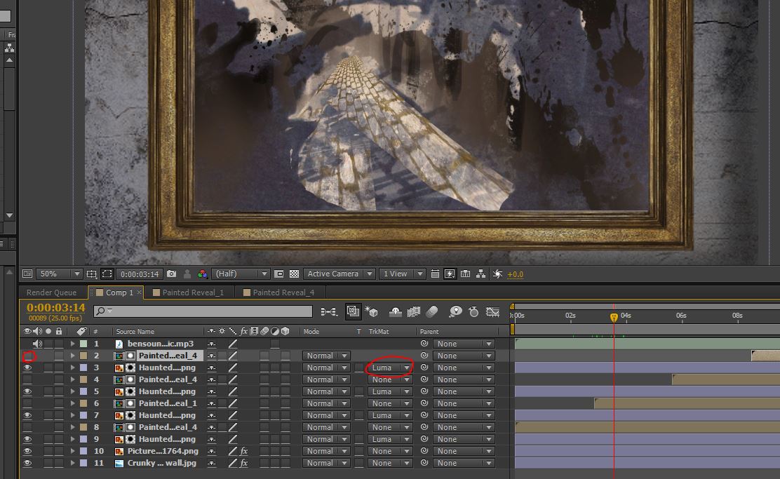
Setting the layers of the images on a Luma Matte layer, with the pre-composed paint splats and strokes hidden above, this created the effect of the painted reveal - as the white of the inverted brush strokes animate in, the luma matte layer is revealed.


Setting the layers of the images on a Luma Matte layer, with the pre-composed paint splats and strokes hidden above, this created the effect of the painted reveal - as the white of the inverted brush strokes animate in, the luma matte layer is revealed.
Motion Test
Week 4
Video Case Study - Double Exposure


I have always loved this style of motion graphic, but never knew how it was created - perhaps that's why I found it so intriguing. And now I understand! This task was great, I plan to make my own green screen in the future so I can create my own double exposure effects from scratch.
Pastiche - Double Exposure
There are some great resources for inspiration with this theme, I found the following to be great examples.
I absolutely love this style of imagery, I have always found them awe-inspiring and wanted to attempt my own version for this weeks theme. These images below are were the main drivers for the final design.


Sourced Footage
I wanted to use the theme of 'nature' for this piece of work, following the inspiration images I found. The following images were used in the creation of the style frame.

https://static.pexels.com/photos/4827/nature-forest-trees-fog.jpeg

http://cdn.playbuzz.com/cdn/8817b001-4989-48f3-86d4-8c97a8064ac9/9caa0f67-5afe-43ff-8c96-8761f17d02f5.jpg
Style Frame
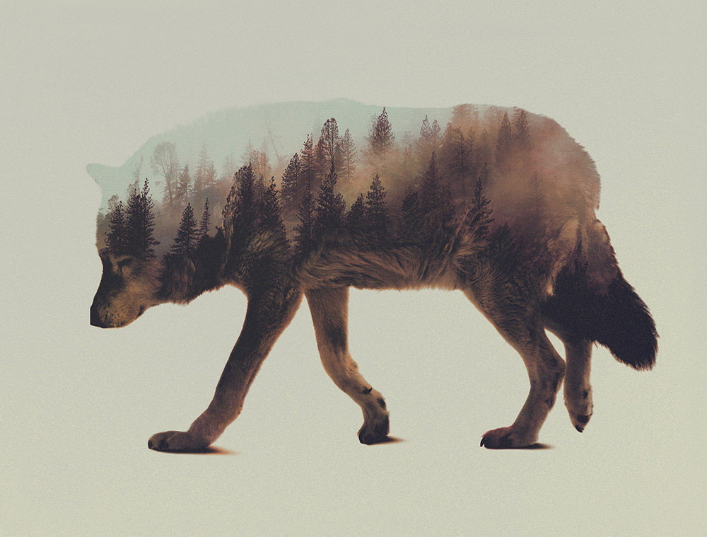
Utilizing an alpha transparency layer we learnt in week 3, I was able to create a double exposure effect with the forest image showing through the silhouette of the wolf. The final style frame turned out exactly how I wanted - pretty cool I think! Next time I'd like to go and create my own footage and imagery and try again.

Process & Discoveries
Using the mask tool, I cut out the wolf from the image to provide transparency in the background.

For the final motion test I duplicated the forest image and adjusted the scale and brightness to add depth to the separate images, and overlapped the movement, creating an interesting parallax effect. The parallax helped to add visual interest to the movement and added depth to the image, we learnt about this in this weeks tutorial, but I did not execute it as well as I could have - now with this theme I felt as though I got my head around the concept and I was able to effectively utilize it in this motion test.

Using a mask over the wolf image, I was able to divide the forest and the wolf to blend both images together and reveal both sides - creating a fade effect from the wolf to the forest.

Use of a null object allowed me to change the global scale of the comp as the footage played out, adding movement. And the alpha matte layer created the double exposure effect through the wolf sillouhette.

Motion Test
I'm happy with how the motion turned out, was a really fun project to play with this week. Next time I would spend more time adjusting the colours and contrast, as it feels a little washed out. (royalty free audio from http://www.bensound.com/)
Pastiche - Footage to Sketch
Continuing with the pastiche theme, I wanted to create another style frame and motion test, this time focusing on 'Footage to Sketch' - where imagery or footage is hand drawn.
Inspiration
The Idea
I went out and recorded some footage of my dog playing ball outside, I had the idea that the video footage will play until an interesting frame with solid composition occurs, it will then pause at this point and turn into a sketched image.

Style Frame
Using photoshop, I manipulated and drew over the chosen frame to create a sketched effect - this frame turned out exactly how I wanted - the composition is solid, utilizing the rule of thirds and is an interesting image overall - therefore I knew I was well setup to create solid motion.

Layer Breakdown
Following with a similar technique I used for the painted reveal in week 3 (keep finding previous techniques very useful in lots of different ideas!) I used an inverted mask to reveal the layers to create a sketched effect. Below is the break down of the layers.


Process & Discoveries
Masks were placed in different locations to vary the reveals for interest and an organic feeling. This time around for the reveals of each layer I didn't use a luma or alpha matte, I simply used the layer breakdown on multiply to overlay ontop of eachother - this was easy to do using the existing photoshop file as a composition with layers.

Motion Test
In the final to help ease into the transition, I added a sepia layer to 'wash' over the video footage - this helped to blend the two styles together in the transition. To improve the motion, I could have possibly added a subtle pan/zoom to the style frame to add movement. (royalty free audio from http://www.bensound.com/)
Week 5
Expressions Tutorial
Circle Vs Square
Inspiration
I found this theme quite interesting to play around with as it was abstract and very open. I began with my research, and found that it was a common task done by many animators.
https://vimeo.com/130886437
http://greyscalegorilla.com/2009/04/circle-vs-square-midpoint/
I was interested in creating some sort of pattern utilizing expressions that we learnt in the tutorial this week. I found some great inspiration for this. I thought it would be clever to incorporate a homage to pacman in one of the frames.


The use of negative space in this image below was extremely inspirational for the style frames and fit in well with the pacman idea I had.

The Idea
Taking the inspiration that I found I went ahead and played around with different pattern ideas and how I could create my own style frames for this theme. I found this exploration very useful for the final creations.

Style Frames
Using illustrator to develop the style frames, I used my sketches as reference to create the finals. Incorporating negative space, pacman, and an interesting pattern that would blend well with expression animation. The idea for motion would be that four pacmans come from the four corners of the screen, latch onto a square in negative, reveal a square, then explode into a rotating expression pattern.


Process & Discoveries
Using the expressions created in this weeks tutorial, I duplicated them and created 6 different expressions to achieve the pattern. These were broken down into 2 sections, 3 expressions each.

Using the control layer on each animator, I was able to edit the values with ease. I adjusted the shapes and created the pattern designed in the style frame.

Each animator had it's seperate unique object which is what allowed me to freely change the values. Using the x position keys and the graph editor I adjusted the distance to spread out the animators and finally create the desired pattern.

Motion Test
The final turned out exactly how I wanted, this was a great example for me to really see how useful style frames are, making motion an easy task - instead of designing on the fly. Using the expressions made for the tutorial, I duplicated them, modified the shapes and created the pattern shown in the style frame. The movement turned out exactly how I wanted. In the future I could add more variation by creating different movement keys inside the expressions - but for this pattern it worked out well. After the expressions explode out, I animated the composition to rotate adding visual interest. (royalty free audio from http://www.bensound.com/)
Week 6
Coffee & Hexagons (audio driven)
Inspiration
This weeks theme was very abstract, and I'm not going to lie - I had a hard time trying to think of something to make for this week. I knew I wanted to continue further with expressions from the prior week, but I wasn't sure where it would head - so, inspiration time!
https://vimeo.com/139933727


The Idea
After searching for inspiration, an idea finally clicked with me with the theme. While looking at a colour wheel displayed a triadic colour scheme, I noticed a hexagon! I thought this would be a really clever way to utilize the hexagon theme (triadic x 2). See the red hexagon outlined in the image below.

With this idea revolving around the colour scheme, I found that the sides of the hexagon in the centre could be split up into 6 different elements, and 6 different colours.

Audio
Process & Discoveries
The waveform in the audio was extremely useful as it helped me find where to place my keyframes, and how they should behave.

I found that utilizing the graph editor for the keyframes was an effective way to adjust and fine-tune the expressions easily. I used this as a way to try and mimic the waveform of the audio to add variation in the movement as it matches the sound.


Style Frame
The final style frame stayed true to the original sketch, but with an added graphic element in the middle which utilizes expressions - I wanted to include this because I was excited to continue with expressions that were created the previous week.

Motion Test
Quite happy with the outcome, but I feel like there is something missing from it, it feels very static. Other than that, this was a great exercise to understand how to create an audio-driven motion graphic. I was happy with the concept, and thought it was an interesting idea - but in motion it is not exactly what I expected. (royalty free audio from http://www.bensound.com/)
Week 7 - Concept Development
Starter Word
Energy
Free Writing
Energy is
power, power is movement and movement is motion. Strength and speed, force and direction,
change, life, growth, abundance, light, flickering, vibrating, shaking,
falling, transfer, transformation, transaction, transcend, transmporph,
conversion, convert, morphing, bouncing, bounce, bright, mood, fast, lightening,
sound, barrier, breaking, break barriers, contrast, rapid, flow, pace,
curiosity, engaging, fun, dynamic, purpose, purposeful, dimension, magic,
yellow light, transfer, rebound, change, shock, shocking lightning, powerful
change, engaging movement, flowing transformation and transfer of power into
different objects and transfer LIFE. To give life, to move, to flow, the breeze
outside, the sound of the trees in the wind, energy of the earth, the sun,
gravity, forces. Break, crash, dance, clip, clasp, bang, shut, open, slam open
a door way with pure excitement and rush to your destination, excitement, the
smile of a child as they play, freedom, a see-saw, a rock flying through the
air after someone had jumped on the end of a see-saw, action causes a reaction,
every reaction has a purpose, what is it’s purpose?> What is the meaning,
how do you become energized, what foods invoke energy, why do people feeling
exhausted and out of energy, why do they rely on drugs like caffeine to feel energized
and feel full of life, what is the meaning of it all and why does it affect our
quality of life so much.. Energy IS life – without energy we are drained and
are not living, livening with energy is the meaning of life – it is to enjoy
life, to feel life and to feel engaged with every moment of your life. Energy allows
the world around us to grow and flow with purpose.
Key Words
MOVEMENT / IDLE
LIFE /
LETHARGY
CHANGE /
STAGNATION
TRANSFORM /
REMAIN
TRANSMOGRIFICATION
/ FAILURE, UNIFORMITY, SIMILARITY
POWER /
WEAKNESS
CONTRAST /
CONFORMITY, SAMENESS
FLOW / STOP,
SCARCITY
PACE / SLOW
CURIOSITY / DISINTEREST
ENGAGING /
BORING, UNFRIENDLY
DYNAMIC / INCAPABLE
PURPOSE / LOST,
DISLIKE
TRANSFER /
STAGNATION, KEEP, HOLD
REBOUND /
DESTROY
SPEED /
SLUGGISH
FORCE /
POWERLESSNESS
EXCITEMENT /
DEPRESSION
FREEDOM /
RESTRAINT
ACTION / INACTIVITY
REACTION /
LOSS
INVOKE /
ANSWER
QUALITY /
INFERIOR
ENERGERGIZED
/ DRAINED
ENJOY / HATE
MEANING / ABSENSE,
LOSS
GROWTH / DESTRUCTION
UNPREDICATABLE
/ UNCHANGING
EVOLUTION /
REDUCTION
SOFT / SHARP
Mind Map

Do's & Don'ts
Visual Style
Simple vector graphics, solid forms, colours and shapes –
Clean look
Avoid photography or complex textures
Emotions
Happiness, Joy, surprise, excitement
Possibly contrast with opposite emotions
Avoid making the user feel jealousy, sadness, fear, remorse,
anger – unless contrasted for impact
Ideas
The concept of ‘energy’ will be displayed in the graphic
elements and their movement in the motion graphic. Utilizing action/reaction,
shapes, forms and visuals developing in real-time, transmogrification of forms,
morphing, popping, stretch, distort, overlapping movement, all animation
concepts that help to portray ‘energy’ and effective ‘flow’ for the piece.
Utilize existing graphical
elements and add 'energy' to them and promote 'flow' Morph objects to create new
ones "Transmorgrification" Visual connection between
each frame with dynamic transitions Simple geometric shapes
with energy to tell a story / flow through frames Transforming, morphing, to
display growth and life Focus on energy of
movement, not complexity of graphics
Story
Explain who I am as a person and as a designer, in an
engaging, ‘energized’ way that will leave the user feeling excited and eager to
find out more. The story will be a simple one, beginning with quick facts about
me: My name, where I was born, where I live, where & what I study. Then
going into more detail with some things I like: Volleyball, weightlifting,
drawing & design, video games and my pet. Then finishing off with my skills
and contact details. In the end the motion graphic should make the viewer feel
energized, excite and engage them, and leave them wanting more.
Avoid an abstract piece on ‘Energy’ but instead allow this
theme to enhance the flow and power of another story
Mood Board

Considerations & Approach
We have all seen images and motion graphics created by designers in the past. My approach to design will bring excitement, happiness, joy, surprise, and most importantly, energy. Energy allows the world around us to grow and flow with purpose. Energy is life. You will see as I breathe life into my designs.
I will walk you through a story of who I am and how came to be. Simplicity, clean, with engaging, energetic motion, you will experience transmogrification of forms as they morph, distort, stretch and pop to life. Enjoy the ebb and flow as elements act and react with each other and the forces set upon them, guiding you through the story.
Enjoy playful type as I greet you, follow the spherical element as it tumbles downward, stretching as it falls, and then watch as it bursts with energy and life into the sun. Understand what I love, as graphics fly through the frame with a burst of energy, travelling through as elements pop to life.
Week 8 - About Me
A motion graphic about me
Inspiration
For this week, we are to make a style frame/s that will lead on to our final 1 minute+ animation. So I committed a bit of time finding inspiration and ideas that click with me as an individual. I found the 'About me' and CV style vector animations extremely appealing, and I was excited to try this style for my final animation, and therefore choice this for week 8.
The following videos are probably my favourite and are best at reflecting the type of animation I'd like to create.
The Idea
I started with quick & dirty storyboards to try and break down each style frame for the animation as a whole, adding in some notes here and there in regards to ideas for motion.
Starting with who I am and where I'm from - then some things about me - then my skills - then my contact
Starting with who I am and where I'm from - then some things about me - then my skills - then my contact

In the final animation (assignment 2) I'd like to play with morphing graphics, where one image morphs into another. I thought a clever way to do this would be to represent my sausage dog as a hot dog, and then blend into a dog - just a fun idea that may or may not happen!

I then focused in on a couple frames to create for this week, developing the idea of Hey!, with the circle of the exclamation mark falling into the next frame which will be a rising sun, and then a profile of myself.


Style Frames
While exploring for inspiration, I came across a concept of 'Stuff coming out of stuff' and I wanted to play around with this idea, adding much more interest and life to simple type (see motion test). On top of this, I planned to add more life and movement to the text by utilizing the circle in the exclamation mark in the transition to the next frame, making it break away and fall downwards. I'm interested in making clever transitions between frames that utilize the graphical elements on the previous style frame, I feel as though this adds a flow to the piece.

I've always liked the 'Rising Sun' as a graphic and I wanted to incorporate it into one of the style frames, with the ball flying through the frame it blended well together. I think the contrast of colours between black and orange creates an appealing frame.

When talking about me, I wanted to show some of the applications that I have experience in, I thought using a vector graphic profile of myself, and the icons of the software would be an interesting way to show this. I'd like to add more life to the 'pops' of these icons somehow, with motion & audio.

Process & Discoveries
Something I feel that is worth mentioning is the use of colours in these frames, I always struggled with selecting appealing colours in my artworks in the past - until I realised something. I was using highly saturated colours. When I wanted something green, I simply chose green, an ugly, high saturated, high contrast green that would never occur in nature, but I had no idea what was wrong.
After doing some research in colour theory, I finally understood that the colours I was using were unnatural and that's why it looked so ugly and wrong. I then introduced desaturated colours and, with purpose, increasing saturation in areas I want the focus to be - improving the overall composition. As you can see, there's a huge difference between the frame above and the frame below in colour and visual appeal - it was a great learning experience worth sharing.

After doing some research in colour theory, I finally understood that the colours I was using were unnatural and that's why it looked so ugly and wrong. I then introduced desaturated colours and, with purpose, increasing saturation in areas I want the focus to be - improving the overall composition. As you can see, there's a huge difference between the frame above and the frame below in colour and visual appeal - it was a great learning experience worth sharing.

For management of the composition in after effects, I made sure to pre-compose each style frame. This was very useful to organize the file, making it easy to work with.

As the text slides out, I added a background sliding transition to help enforce the movement and adding life to the animation. I noticed this technique being used in the animations I was inspired by, and I decided to try it too, I love the effect.
Again, use of a background transition to help enforce the animation, adding extra life to the 'pop' as the exclamation mark appears. I also used the 'morphing' technique I found during research in the reveal of the exclamation mark, this helps to utilize existing graphics on the frame and removes any clutter whilst enhancing the flow of the animation.
And again, utilizing the background transition to enhance the movement - I'm really finding this technique to be extremely useful in improving the quality and flow of the frames. Also notice as the ball falls, it stretches using animation principles of squash and stretch (and exaggeration).
The paths for the shapes were animated to create the reveal effect of the rays and ground.


I used the ground element of the rising sun from the previous frame for the transition into the next frame to flow through, this worked really well. I feel as though this style of transition enhances the animation as a whole and I am eager to keep it consistent throughout.
Taking advantage of of the layers in the illustrator file for the avatar of myself, I was able to easily pre-compose and manage the animation. Again, using three keys, the layers scaled in from 0% to 110% to 100% for 'pop' with overlap for flow.
Motion Test
Overall I'm quite happy with this motion test, some of the timing needs work and the typography on style frame 2 could be improved as it feels quite dull. I would like to add more overlapping/subtle animations on top of the existing keys to create more movement and life. For example, animated movement lines as the text moves and ball moves, and show more reaction. For the final, I plan to add more interesting audio to add more life and power to the animations. I feel like I've really connected with this style, and is a clear representation of myself, and what I think of when I hear 'Motion Graphics', it just feels right! (royalty free audio from http://www.bensound.com/)
Concept Development
Concept Development


Design Board

Text
Final
The Story
I will walk you through a story of who I am with simple,
clean, engaging and energetic motion, you will experience transmogrification of
forms as they morph, distort, stretch and pop to life. Enjoy the ebb and flow
as elements act and react with each other and the forces set upon them, guiding
you through the story.
The concept of ‘energy’ will be displayed in the graphic
elements and their movement in the motion graphic. Utilizing action/reaction,
shapes, forms and visuals developing in real-time, transmogrification of forms,
morphing, popping, stretch, distort, overlapping movement, all animation
concepts that help to portray ‘energy’ and effective ‘flow’ for the piece.
You, the viewer will learn who I am as a person and as a designer, in an
engaging, ‘energized’ way that will leave the viewer feeling excited and eager
to find out more. The story will be a simple one, beginning with quick facts
about me: My name, where I was born, where I live, where & what I study.
Then going into more detail with some things I like: Volleyball, weightlifting,
drawing & design, video games and my pet. Then finishing off with my skills
and contact details, closing with a logo resolve. In the end the motion graphic
should make the viewer feel energized, excite and engage them, and leave them
wanting more.
Process & Discoveries
I've learnt a lot over this semester and have developed a exciting confidence and competency within after effects. Looking at the original design board, I felt as though they were quite dull and lacking vibrance when compared to the moodboard I was aiming to achieve the feel of. With feedback from my tutor and further analysis, I was able to vastly improve each style frame for much greater visual impact. This was achieved by adding depth in the image through 3D layers, improving the motion with motion blur, adding a subtle gradient, drop shadows and an interesting tactile feel through textured overlay. Overall I'm really impressed with how this turned out, it was an extremely fun process and linked some of my favourite software packages together which made it really enjoyable. Adobe Illustrator and After Effects were the main packages used here, with a little bit of photoshop here and there.
Design Board

Style Frames


About Me
https://vimeo.com/185957803
Music: http://www.bensound.com/royalty-free-music
Nice Blog, We are offering Visual effects services miami and Motion graphics animation miami. Allow us to give you a FREE CONSULTATION.
ReplyDeleteAre you looking for Camera Lens & Accessories Rental? So Media Monsters is the right place we provide Cinema Camera Rentals Miami and video equipment rentals Miami
ReplyDeleteFashion Handbag Collections is a US-based online retailer. We provide a wide range of affordable Birkin Togo Bags online.
ReplyDeleteAre you looking for a Melbourne Maxi Taxi ? Then you've come to the right place to reserve a maxi cab for your family or airport transfers. We offer maxi taxi services from door to door.
ReplyDeleteForever Metals is a trusted brand supplier of tungsten rings in USA. Choose the wide collection of tungsten rings for showing commemorate love, anniversaries, friendships and achievement. Visit our website
ReplyDeleteYour ideal online buying destination for awesome goods is On Shiny Meteor Gaming . We want to provide you with the top goods available anywhere in the world. Visit our website for more details.
ReplyDeleteOne of the top worldwide IT consulting companies, Sing Technologies is headquartered in Singapore. Our main goal is to provide aspiring business owners and entrepreneurs like you with first-rate consulting services using a variety of tactics that are both affordable and scalable. Visit our website for more details: https://singtecs.com
ReplyDeleteThe website Instant Key
ReplyDeleteis not your ordinary Internet store. Everything is available through your computer or phone and is reasonably priced. We deliver all our products digitally in minutes via email and our website system. For more details Visit our website. https://instant-key.com/
With a long-lasting, natural renewing effect, the Stendo Face profoundly stimulates the skin, aids in the reduction of fine wrinkles, and enhances beauty. For more Information please visit our website: https://stendobeauty.com.au/
ReplyDeleteOn Shiny Meteor Gaming is your ultimate online shopping destination for super cool stuff. We intend to bring out the best products from all over the world to you.
ReplyDeleteKuala Lumpur Tour packages includes visiting historical sites, lush urban parks, vibrant markets, busy streets, and exciting nightlife. Our goal is to make your trip a pleasant and memorable one. Here you are given the best offers on holiday tour packages, visit our website for more details.
ReplyDeleteFor businesses offering top Digital Marketing Tirunelveli, integrating motion graphics into their online presence can be a strategic move. By incorporating the keyword "website design company tirunelveli" into content related to motion graphics in UI/UX, these businesses can enhance their local search visibility and attract clients seeking cutting-edge digital marketing solutions in the Tirunelveli region.
ReplyDelete